Understanding Obesity in the US
Question 1: Is a state’s energy consumption a reflectance of its percentage of physically active adults?
As is evident from the OLS results in figure 1, a correlation between energy consumption and physical activity was found in large regions of the US (those in yellow), however there were also significant portions that do not show this correlation (orange and blue regions). While those in the orange regions were more physically active than would be predicted based on their energy consumption, those in the blue regions were less physically active. For this reason the adjusted R^2 was only 0.006427. There is also very strong spatial clustering. This suggests that there are flaws Roberts & Edwards theory.
In order to explore this relationship further, I produced a map showing the number of recreation/ fitness facilities and compared it to the previous OLS results. This relationship can be seen in figure 2. Here we can see that the orange regions on the OLS map match up with the areas with high numbers of gyms. This shows that while some regions use large amounts of energy, likely out of necessity, they also go out of their way to exercise in order to make up for the large portions of the day in which they are immobile. This is something that Roberts & Edwards do not account for.
Results:
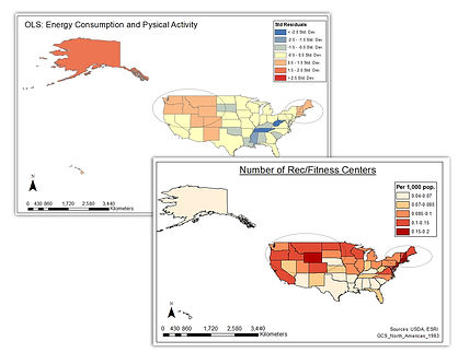
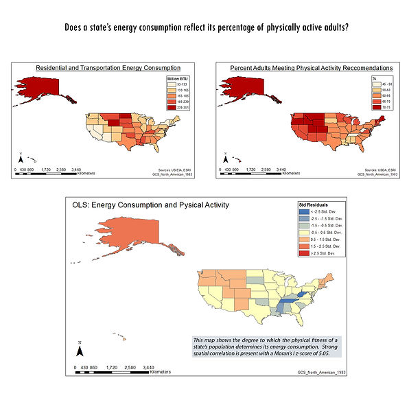
Fig. 1
Fig. 2
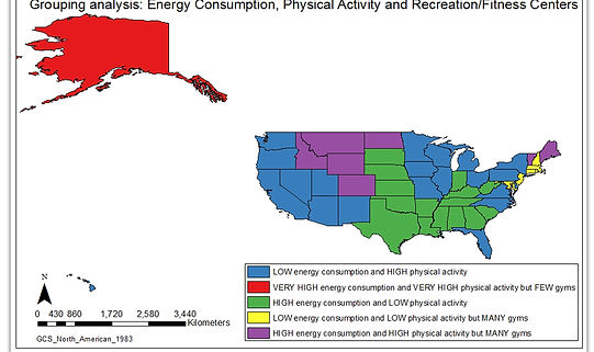
Fig.3
The grouping analysis in figure 3, however, does highlight a large portion of the US in which Roberts & Edwards theory holds up. These are represented by the blue and green regions in which low energy consumption is correlated with high physical activity and high energy consumption is correlated with low physical activity. This is more convincing than the results originally produced by the OLS regression. Within the purple region, we see the effect of the high number of recreation facilities that was previously highlighted which solves the major problems within the OLS map. The yellow region, however, is somewhat of an anomaly with low energy consumption, low physical activity and an abundance of gyms. Alaska also shows strange results (high energy usage, low obesity and few gyms). These can likely be explained by the cold weather in this state as well as the large area of the state, meaning that it likely uses more energy to heat homes and more gas to get to from place to place. More research, however, is needed to explain these odd characteristics, especially in the yellow region.
Overall, due to the shear amount of blue and green on the grouping analysis map, I think that the negative correlation between physical activity and energy consumption as suggested by Roberts and Edwards can be seen as legitimate. Thus, in many areas of the US, the increased use of motorized vehicles and electronics do seem to be at fault for decreased physical activity regardless of the few regional variations.
Question 2: Which has a greater impact on obesity: activity or diet?

Fig.4
The results of the OLS regression comparing a state’s physical activity levels and its percentage of obese adults were quite interesting. The produced R^2 value was 0.48… meaning that physical activity explains about 50% of the obesity story in the US. That’s an extremely high R^2 for a single variable and is thus compelling.
On the diet side of the situation, the results were quite different. It is important to note, however, that I was not able to get data that specifically stated caloric intake per state. Instead I used data describing per capita expenditure on fast food per state. This means that my analysis does not accurately represent the diet side of the equation. However, as was discussed, fast food has been largely attributed to obesity in the US and thus testing this correlation is still important. Regardless, the results of the OLS regression comparing a state’s annual per capita fast food expenditure and its obesity levels were interesting. The adjusted R^2 this time was only about 0.07… meaning that fast food consumption only

Fig 4.
explains 7% of the obesity story within the US. This is drastically lower than the R^2 value of the previous OLS regression. The spatial autocorrelation of this fast food/obesity OLS map is also extremely high with the map receiving a z score of over 8. The z-score of the previous OLS map (Activity/obesity) was only just above 3. This is however still spatially auto correlated but to a lesser degree.
Overall, while the results cannot prove that physical activity contributes to obesity more so than diet, they do strongly suggest that it contributes much more to obesity than the consumption of fast food. This again corroborates the claims of Roberts & Edwards (2010).
Question 3: What are the other variables aside from activity and diet that have an impact on obesity?
Fig. 7


Fig. 6
Fig. 7
In order to identify other important variables, I began by simply viewing a variety of maps side by side with the map of obesity within the US. Based on this technique, I noticed a convincing correlation between poverty rates and obesity. When conducting an OLS analysis with poverty as the independent variable and obesity as the dependent, an adjusted R^2 value of about 0.3 was produced. This is much higher than the R^2 value for the fast food/obesity OLS regression. This suggests that poverty has a lot more to do with the obesity epidemic in the US than the fast food industry.
In order to get a more complete picture of obesity in the US, I conducted an OLS regression analysis with all of the variables I had collected. These include those already discussed (ie. fast food expenditure, percentage physically active adults, energy consumption per capita, number of recreation facilities per 1,000 pop) as well as the percentage of population below the poverty line, percentage of adults over 25 with a high school diploma, and the percentage of the population living in urban areas. The results of this analysis are illustrated in figure 7. Some interesting results can be drawn from these graphs. First of all, fast food consumption appears to have a negative correlation with obesity, meaning that as obesity rates lower, fast food expenditure goes up. Another important scatterplot to examine is the one depicting poverty rate. Again we see a strong positive correlation between poverty rate and obesity, reinforcing the results previously discussed. The percentage of urban population also shows a fairly strong correlation, this time negative, as does the number of recreation/ fitness facilities. By accounting for all of these variables, an adjusted R^2 value of 0.686603 is produced. This means that together, these factors account for 70% of the obesity story in the US. This is an extremely high percentage considering that caloric intake of food was not considered. The Moran's I resuts shown in fig. 8 also show that the results were not spatially autocorrelated, making the results significant. While these results may suggest that diet is a less important causal factor of the current obesity crisis in the US, it also shows that physical activity alone cannot explain the entire situation either. The causes of obesity are thus vast, making obesity difficult to combat.
Fig 5.
Fig 6.
Fig 7.
Constructing a Spatial Understanding of Obesity in the US:
Fig 9.
This final map (fig 9.) was produced by inputting all of the variables used within the previous OLS regression into a grouping analysis. This helps view the varying importance of factors across space. Some of the most interesting results again relate to fast food consumption. Those regions with the lowest obesity in the US also happen to have the highest fast food expenditure. However it is important to note that having the lowest obesity in America does not actually mean these areas have low obesity in the scheme of things. It is also interesting that 80-100% of the inhabitants of this region (referred to as the urban dwellers region) reside in urban areas. Urban regions tend to be more walkable and have better public transit systems. This region seems to agree with this assumption, possessing relatively low levels of per capita energy consumption. This again links back to Roberts & Edwards arguments. Thus it seems that in urban areas, the rise of obesity (perhaps brought on by fast food consumption in this case) is being slowed by the continuance of a daily exercise regime.
Another interesting region to examine is the Lower BMI zone. While this region ranges in its energy consumption, its obesity levels stay relatively low compared to other parts of the country. This seems to be explained through their wide access to gyms and recreation facilities. This access, however, is likely due to a large demand. This region, then, may simply have a different cultural view of exercise and staying fit than of that in the south, which encourages them to go out of their way and exercise, rather than relying on daily activities. Perhaps it can also be explained by the higher levels of education seen in this region than in the South. This difference (cultural, educational, etc.) is thus an important area for future study.
The final two areas of interest are the danger zone and the danger zone periphery. It is no mystery that the deep South has had the hardest time managing rising obesity, but what is interesting is the spatial pattern formed around it, almost like concentric rings. This grouping analysis was done with no spatial restrictions, meaning states were grouped together regardless of their geographical proximity to one another. Yet what we see is a strong spatial pattern, suggesting that proximity to other states (and to the danger zone) does matter. Obesity seems to cascade away from the danger zone with decreasing intensity. This proximal relationship may prove to be an interesting and valuable area for further study.
Error, Uncertainty and Limitations:
The maps created within this project are useful as a starting point for understanding obesity in the US but lack some important variables that may better explain the situation like food income per capita. Other factors that may be tampering the results are things like age distribution (eg. urban areas may have lower obesity because their inhabitants are younger and thus have faster metabolisms) and weather (eg. colder regions use more energy). As well, the data was used from a variety of sources and collected over a variety of years (2007- 2011). By comparing data collected with different approaches and at different time periods, the results may have been skewed.
Results may also be skewed based on the defintitions used to define each variable. For example, what is a fast food restaurant? The USDA data has defined this as an establishment in which you order before you eat. This does not necessarily entail the selling of energy and caloric dense too. Healthy fast food restaurants are part of a recent trend and may be impacting the results, especially in urban regions.
Other sources of uncertainty may arise from the unit of analysis used for this project. This is known as the modifiable aerial unit problem. If this same analysis had been conducted at the county level scale (instad of the statee level), the results may have been completely different. There is however, no solution to this problem and it is thus inevitable in all spatial analys
Overall, it is important to remember that this is only a simple recreation of the real world, constrained by time and resources. There are thus many other factors at play that were not considered that could impact obsity in the US and it's distribution.

Fig 8. Moran's I results for final OLS regression